|
|
Post by Seirei Hisakata on Jun 4, 2012 16:19:51 GMT -1
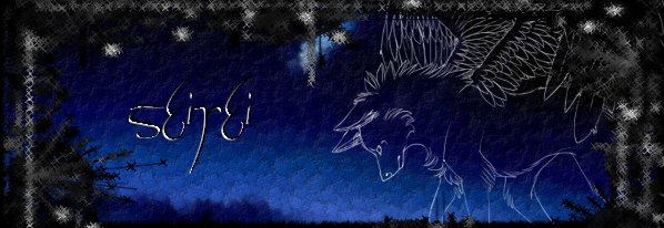
After removing the turquoise box that framed the main banner at the top of the page, I found that the welcome message:
Hey, username, you have 0 messages, 0 are new. 4 Jun, 2012, 5:16pm
pushed the banner to the side and looked a bit awkward.
Now, we could either:
> change the background so that the text stands out a bit more ...
> Change the font colour ...
> Or we could remove the welcome message completely ...
>Or keep it as it is (for you conservatives out there)
What do you think?
Would you like the banner to be in the middle and looking better aesthetically?
Or would you rather keep the message and keep the banner to the side? Bearing in mind you will still be able to login and see messages thanks to the menu bar below.
Seirei
|
|
|
|
Post by Mira-Neiva Fadiele-Koudo on Jun 4, 2012 16:44:35 GMT -1
Banner in middle without the "Hey" message, but a change in banner would be best to match the width of the menu bar.
Also, if the box isn't going to be there, change the gradient/colour behind the menu buttons because it looks weird.
|
|
|
|
Post by Seirei Hisakata on Jun 4, 2012 16:51:50 GMT -1
I was about to say, a new banner would be good ^_^ Maybe we could do a contest or just have whoever wants to design some make a few. I definately agree the welcome message needs to go.
And yes, gradient does need shifting a little, I can fiddle with that another time.
|
|